BRAND STRATEGY | BRAND IDENTITY | MESSAGING
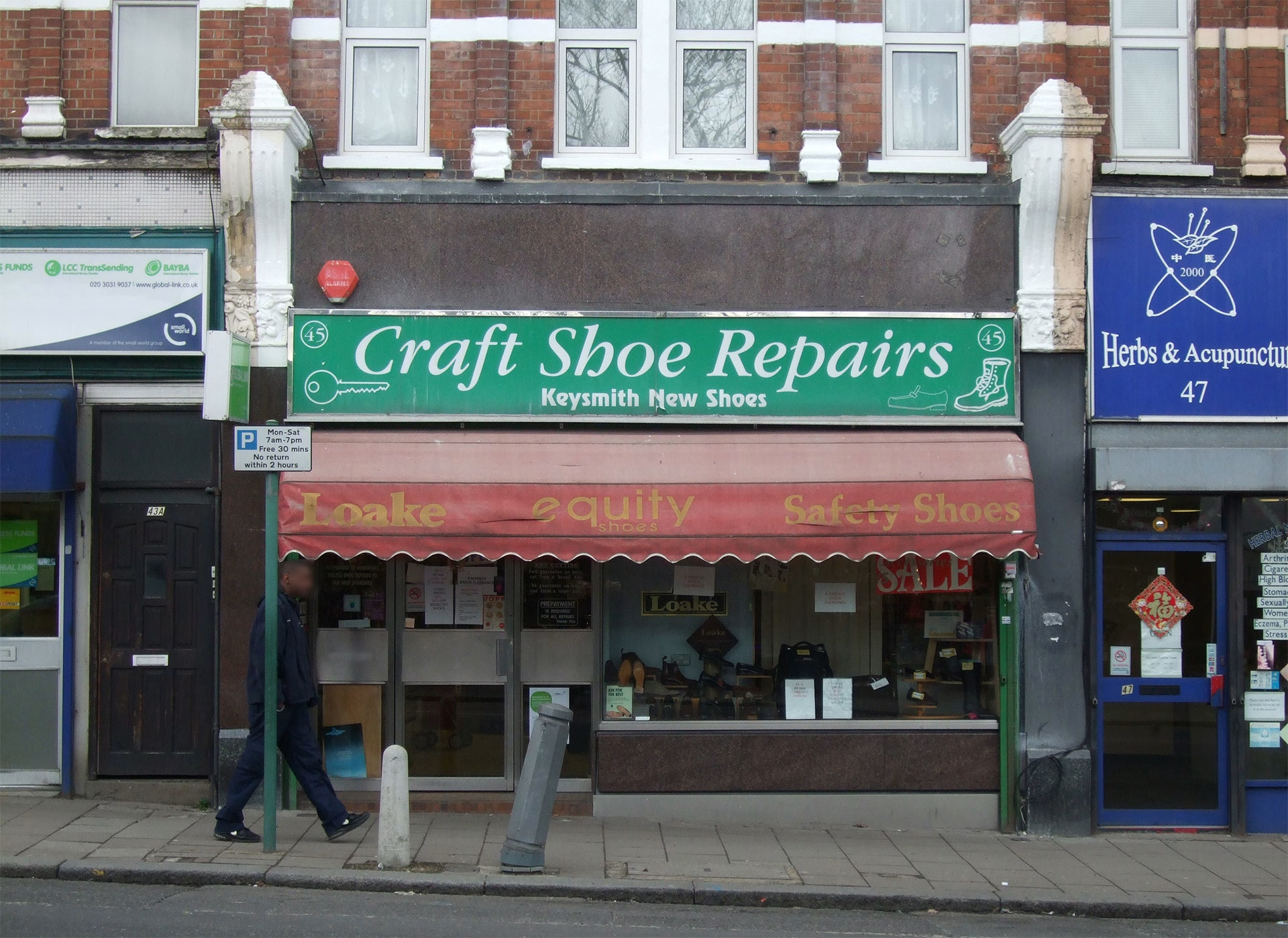
The old shoe repair and keysmith on Sydenham High Street was closing, and a butcher and fishmonger was moving in to take its place. The new business needed an identity that could bring both worlds together.
The shopfront itself also needed some care. It had started to look tired and neglected. The original marble fascia, designed to hold a sign back in Victorian times, was still in place; a real asset that many shops have lost or covered up over the years. Below it, an awkward sign had been added that didn’t respect the building’s original proportions. The awning, worn and outdated, belonged to a completely different era and didn’t feel connected to the rest of the frontage.
The shopfront was redesigned to bring back its original proportions and make better use of what was already there. The marble fascia was reused for a new enamel sign, chosen to age well over time. The result feels modern and confident, while still respecting the building’s character.
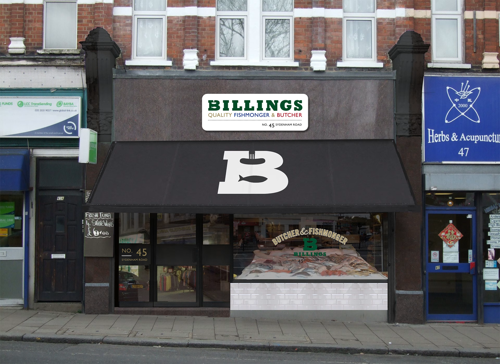
The identity was strong and flexible enough to extend across other touchpoints too, from simple packaging stickers for meat and fish to aprons worn by the team in-store.